Building Your First Data Dashboard: SQL to Visualization
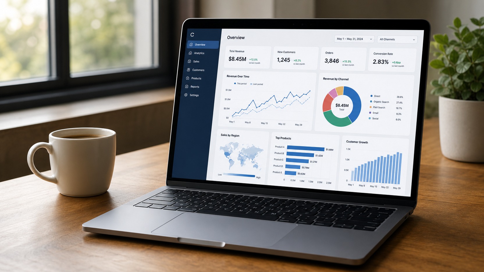
Building a data dashboard is the last mile of the whole modern data stack — the point where clean, modeled data becomes something a person looks at and acts on. Skip the design step and you get a dashboard nobody opens. Skip the SQL foundation and you get a pretty chart hooked to wrong numbers. This guide walks through both halves: the query that feeds the dashboard, and the layout that makes it worth opening.
The SQL foundation (get the numbers right first)
Every chart draws from a query. A dashboard with ten charts is ten queries under the hood. If your query produces a number that doesn’t match what stakeholders expect, the entire dashboard loses trust — and you don’t get a second launch.
| Dashboard type | Typical base table | Example query pattern |
|---|---|---|
| Executive KPI dashboard | Aggregated daily fact table | SUM/revenue by day, filtered to current quarter |
| Operational dashboard | Raw-ish event/log table | COUNT/events in last hour, grouped by status |
| Product analytics dashboard | User-level behavior table | COUNT DISTINCT users over a rolling 7-day window |
Here’s the workflow DataStack Daily recommends:
Step 1. Write the query in your SQL editor, not inside the dashboard tool. Verify the numbers against a raw count from the source. Step 2. Save it as a view or a materialized table — don’t paste raw SQL into a dashboard widget where it’ll be edited six times by six people. Step 3. Point the dashboard tool at the view. If the number is wrong, fix it in one place.
The star schema model is built for exactly this: a clean fact table JOINed to dimensions you can filter and group by. If your dashboard queries are fighting a messy source, model the data upstream first.
Pick the right chart for the question
The biggest dashboard design mistake is picking a chart for how it looks instead of what it communicates. Each chart type answers exactly one kind of question.
| Question | Chart | Why |
|---|---|---|
| “Is the number up or down?” | Line chart (time series) | Direction over time is what a line communicates best |
| “How do things compare to each other?” | Bar chart (horizontal) | Length comparison is the most accurate human perception |
| “What’s the split?” | Stacked bar or treemap | Part-to-whole relationships, 5-8 categories max |
| “Is this metric above or below the threshold?” | Single number + sparkline | Directional indicator with a target line |
| “Where are the problems?” | Heatmap or scatter plot | Outlier and cluster detection across two dimensions |
Layout principles (above the fold)
Your dashboard layout should answer questions in a specific order, top to bottom, left to right. The viewer’s eye starts in the top-left corner — put the most important chart there. Scrolling down is asking for continued attention, so make the top row self-sufficient.
The Zigzag Layout (works on any dashboard tool):
|-----------------|-----------------|
| KPI #1 (big)    | Line chart      |  <- row 1: "what happened"
|                 | (time series)   |
|-----------------|-----------------|
| Bar chart by    | Bar chart by    |  <- row 2: "why did it happen"
| category        | region          |
|-----------------|-----------------|
| Details table   | (spacer)        |  <- row 3: "what can I act on"
|-----------------|-----------------|
Row 1 answers “what happened?” — a single big number plus directional context. Row 2 answers “why?” — dimensional breakdowns. Row 3 answers “what can I do about it?” — the detail table that lets someone take action.
The four-chart dashboard that covers 80% of use cases
You don’t need a dashboard with 14 charts. Four well-chosen charts answer most business questions:
| Chart | What it shows | SQL pattern |
|---|---|---|
| 1. Single number (big) | Primary KPI + % change vs prior period | SUM(kpi) WHERE period = current - 1 for comparison |
| 2. Time-series line | Daily/weekly trend of the KPI | GROUP BY date ORDER BY date over last 30-90 days |
| 3. Horizontal bar | Top 5-10 breakdowns by a dimension | GROUP BY category ORDER BY SUM(kpi) DESC LIMIT 10 |
| 4. Details table | Row-level data the viewer can export/act on | Unaggregated query with relevant filters applied |
This pattern works for revenue dashboards, pipeline monitoring, user growth, support-ticket tracking, and inventory. Start with four charts. Add a fifth chart only when someone asks for it twice.
Dashboard traps to avoid
- The “everything dashboard”: one dashboard with charts for five different teams and three different levels. The CEO doesn’t need the schema name, and the engineer doesn’t need the quarterly revenue bar. Split it into separate dashboards per audience.
- No comparison context: a chart that shows “$1.2M revenue this month” with no prior month, no target, and no year-over-year. Every number needs a reference point. Add a comparison column to every chart’s underlying query.
- Live-querying raw tables: pointing a dashboard directly at a 200-million-row production table with five JOINs. It’ll time out every Monday morning when everyone checks at once. Model the data into an aggregate table first, and run the dashboard on that.
The wall between a good dashboard and a bad one is thin. A good dashboard has fewer charts, each answering one question, each backed by a query that returns in under five seconds. A bad dashboard has fifteen charts that nobody can explain and five that have been broken since March.
FAQ
Which dashboard tool should I start with?
If your team already uses a data warehouse, use whatever BI tool is already licensed: Looker, Tableau, Power BI, or Metabase. If you’re starting fresh and alone, Metabase (open source) and Google Looker Studio (free) are the lowest-friction paths to a working dashboard. All of them connect to Postgres, BigQuery, and Snowflake out of the box.
How often should a dashboard refresh?
Match the refresh rate to the decision cadence. An operational dashboard (on-call monitor, shipping status) should refresh every 1-5 minutes. An executive KPI dashboard refreshes once a day. A weekly team meeting dashboard can be static, generated from last week’s numbers. Faster refresh costs more compute and adds zero value if nobody is looking between refreshes.
How many charts is too many?
If the dashboard scrolls past one screen (roughly 6–8 charts on a 1080p monitor), it’s too long. Nobody scrolls. If you have more than eight charts, split them into multiple dashboards organized by audience or question type. A “daily operations” dashboard and a “monthly review” dashboard serve different purposes and different cadences.
How do I know if anyone uses the dashboard?
Most BI tools report dashboard views. Check weekly: if a dashboard has fewer than five views per week, ask the intended audience if it’s still useful. If not, retire it. An unused dashboard is worse than no dashboard — it adds noise, clutter, and distrust. The best dashboards are the ones people open without being asked.
Dashboards are the sharp end of data engineering: the place where clean models and fast queries meet a person who needs to decide something. Keep them small, keep them fast, and keep them focused on one question each. If you’re building the data model that feeds them, start with the star schema guide. If you need your dashboard queries to return fast, the SQL performance guide and window functions guide cover the patterns that make the difference between a five-second chart and a fifty-second one.
Last updated: July 10, 2026


Comments
Post a Comment